


A new font pairing will not decide what your reader should notice first. Before adding another family, give your headline, supporting copy, and action different jobs.
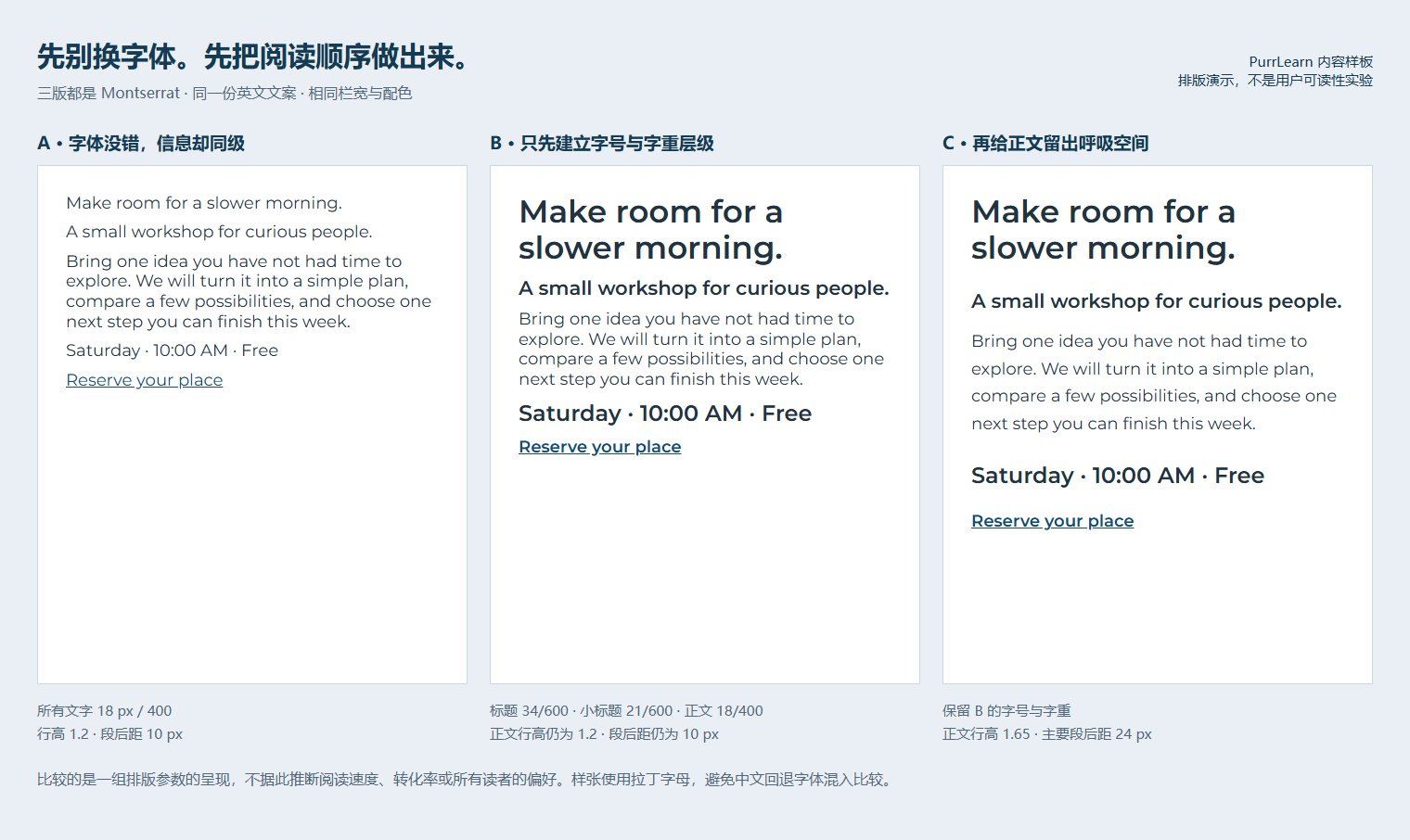
We rendered the same English copy in three layouts. All use the same Montserrat variable-font file, the same colors, and a 464 × 560 CSS-pixel container. These are actual browser renders, not AI-generated mockups.
A: the family is not the problem
In version A, the headline, explanation, event details, and reservation link are all 18 px at weight 400. The information is present, but almost everything speaks at the same volume.
You can still read it. The question is whether the page helps you identify the event, decide whether it suits you, and find the next step. Another typeface could reproduce exactly the same weak hierarchy.
B establishes roles; C changes the rhythm
| Parameter | A: similar emphasis | B: establish hierarchy | C: adjust spacing |
|---|---|---|---|
| Font family | Montserrat | Montserrat | Montserrat |
| Heading | 18 px / 400 | 34 px / 600 | Same as B |
| Subheading | 18 px / 400 | 21 px / 600 | Same as B |
| Body | 18 px / 400 | 18 px / 400 | 18 px / 400 |
| Body line-height | 1.2 | 1.2 | 1.65 |
| Main paragraph gap | 10 px | 10 px | 24 px |
B makes the heading the entry point and distinguishes event details from explanation. C keeps B's type sizes and weights, then increases body line-height and the main gaps between blocks.
The trade-off is height. C takes more vertical space; generous gaps can push an action too far down a small screen. More space is not automatically better.
Check your page with three questions
- What should I know first? Pick one entry point: the event, the product's purpose, or the article's answer.
- What do I need before deciding? Give price, time, or restrictions a distinct role without letting them overwhelm the main message.
- Where do I go next? Make the action findable and describe what it does.
Ask someone who did not design the page to answer those questions. Record what they miss or misunderstand; do not turn your own preference into a claim about every reader.
Download the starter CSS. It reproduces C's main heading/body relationship, not every card detail. Load the font through your normal font pipeline first, then test the values with your actual content.
When changing the font really does help
Change the family when its glyphs do not cover your language, similar characters are difficult to distinguish, the tone is inappropriate, or letters are unclear at the intended size. Those are different problems from hierarchy.
These specimens deliberately use English. They do not demonstrate Chinese typography: Chinese text can fall back to a different font. Check the actual character coverage and line breaks before adapting the layout to another script.
For alternatives after that diagnosis, see our Montserrat pairing examples. To practice spotting visual roles, try the free typography quiz.
What this comparison does not prove
- It verifies the loaded font, identical text, container sizes, and computed CSS values. Read the rendering record.
- It does not measure reading speed, preference, conversion, or accessibility for every reader. We ran no user study.
- A→B changes a group of sizes and weights. B→C changes line-height and gaps together. Neither comparison isolates the causal effect of one CSS property.
- Fixed-size screenshots preserve the controlled comparison; the separate mobile view adapts heading sizes. It is not the same fixed-size experiment.
The principle is an editorial recommendation: fix the roles before expecting a new typeface to fix the page.
Sources and materials
Montserrat's Google Fonts source and license. The local font copy retains its SIL Open Font License. The layout, copy, and visual comparison are our own work; the font source does not endorse our design judgment.